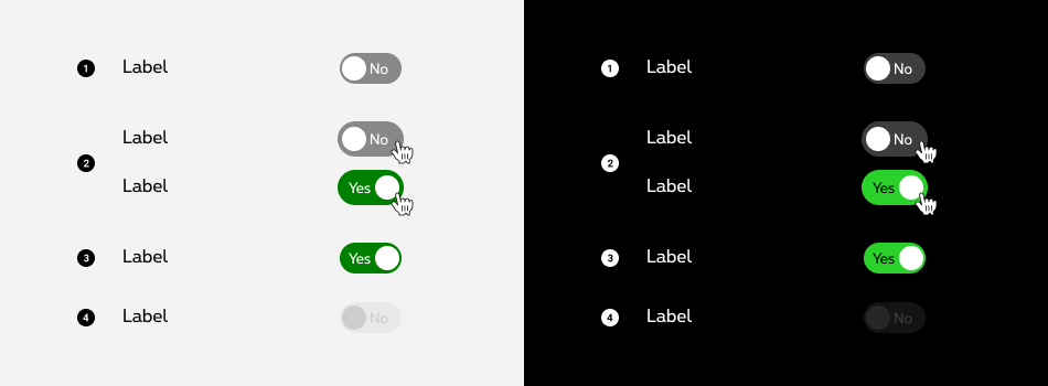
Please don't forget to read Usage part of each element.
Switch
expiry date: 31/12/2023
A switch button toggles between two states, typically "on" and "off," allowing users to activate or deactivate a feature.
Overview
Switches toggle the state of a single setting on or off. Switches are only used for these binary actions that occur immediately after the user "flips the switch".

Forms can be simple or complex, so we have prepared clear recommendations for you to use. These guidelines will help you build your forms and maintain consistency between all the forms of our digital platforms. Discover our recommandations to build a form.
States
A switch is successfully toggled when the switch thumb slides to the other side of the container upon user interaction.

- Default state ("off" state)
- Hover/Focus state
- Active state ("on" state)
- Disabled state
Anatomy

- Label
A label may accompany a switch to further clarify on the action the switch will perform. - Thumb
The thumb indicator the switch state, it have 2 possible positions: at the left or the right in the container. - State indicator
The state indicator confirm the state of the switch, it's a very short label like "on/off" or "yes/no". - Container
A container is displayed around the thumb and the state indicator with a solid color. The color is set depending of the switch's state.
Sizes and colors
Default switch
The switch <input> should always have :
-
role="switch"; -
id="button_id"andname="button_id".
The switch <label> should always have :
-
aria-labelledby="ac-switch-text"who refered to a text who label the switch.
Default negative switch
To have negative version add rs-neg
as parent to rs-switch
.
Disabled switch
The disabled switch <input>
should simply have disabled
attribute.
Disabled negative switch
Deprecated
The negative versions of the switch below should no longer be used.
This element will no longer be available from the expiry date meaning the related css will be removed and the element design will be broken if it's not adapted to the new html.
Class:
-
rs-switch-neg
Configuration metadata
Selector: ds-switch
Class: DSSwitchComponent
Use case example
NOT AVAILABLE LIVE PREVIEW
Inputs
| Name | Type | Default | Required | Description |
|---|---|---|---|---|
| id | string | undefined | Yes | Defines unique id of the component |
| ariaLabel | string | null | No | Sets the accessibility text |
| onLabel | string | On | No | SDefines label when component is in active(ON) status |
| offLabel | string | Off | No | SDefines label when component is in active(OFF) status |
| negative | boolean | false | No | Defines light/dark style of the component |
| disabled | any | true | No | Defines if the control is disabled |
Outputs
| Name | Type | Description |
|---|---|---|
| forwardOnInputClicked | EventEmitter<string> | Emits the selected input when user clicks the selectable box |
Models
        export interface ISelectableBoxesOptions {
            isRadioButtonInput?: boolean;
            negativeStyle?: boolean;
            pickxStyle?: boolean;
            lockedState?: boolean;
            patch?: boolean;
            recommendedBanner?: boolean;
            gridding?: boolean;
            classSize?: string;
        }