Please don't forget to read Usage part of each element.
Components
Find all the available building blocks to compose your pages.
-
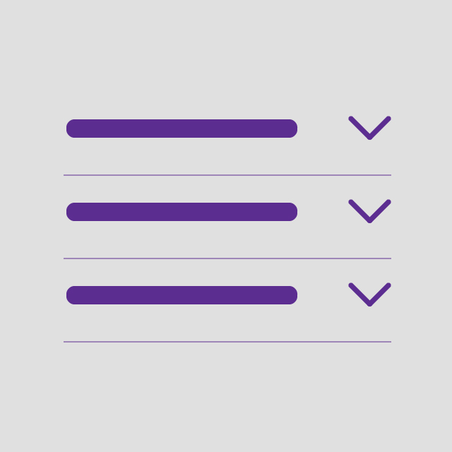
Accordion
Accordions are commonly used to reduce the need to scroll when presenting multiple contents on a single page.
-
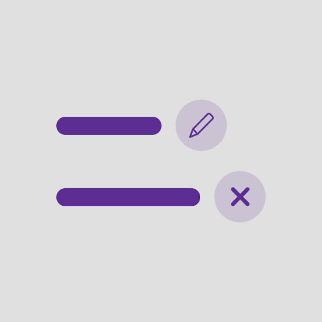
Actions
List of different actions for the user.
-
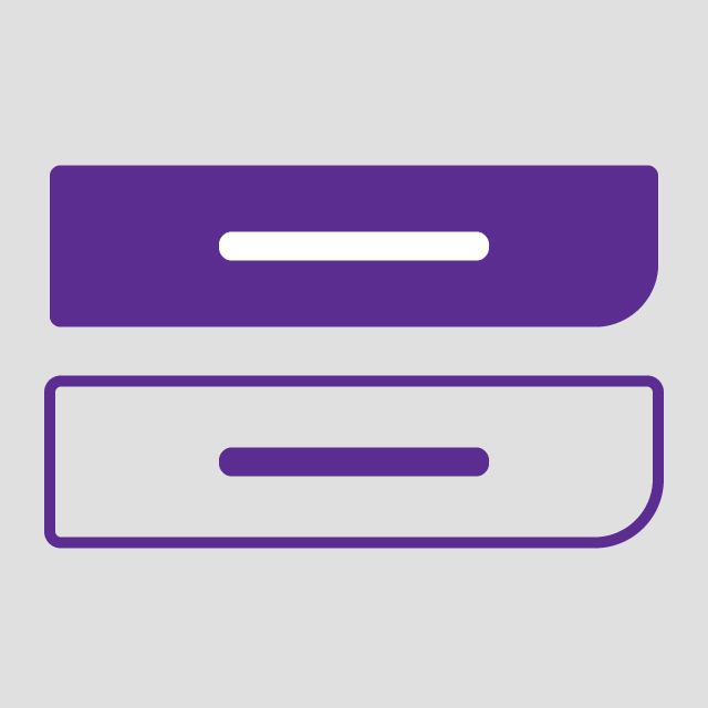
Button
Buttons allow users to take actions, and make choices, with a single tap or click.
-

Carousel
A carousel allows the user navigate through related set of content items in a row.
-
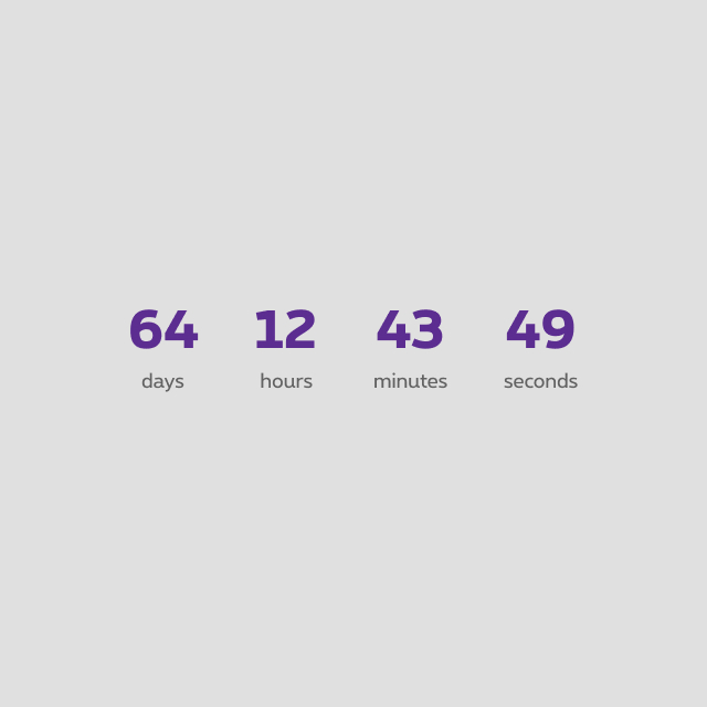
Countdown
Countdown timer displays the time remaining and count down to a specific moment.
-
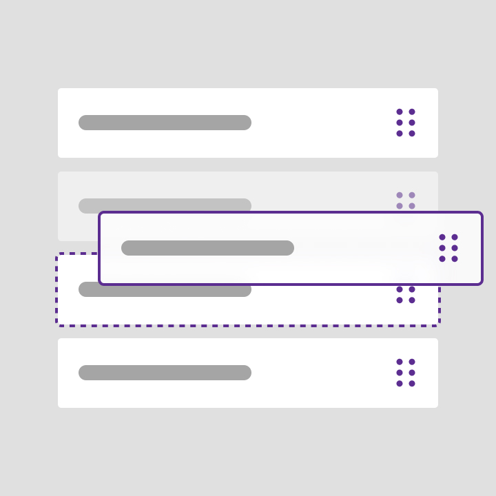
Drag and Drop
Drag and drop lets users select and move items on the screen.
-
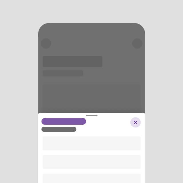
Drawer
A drawer is a modal or nonmodal container providing the user with contextual actions or a subtask without making them exit the parent flow or task.
-
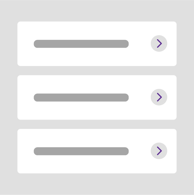
Entrypoints
Entrypoints contain few information about a single product and allow users to go to the dedicated details page.
-
Links
Default links allow users to navigate from page to page in the website and give access to informative, non-mandatory content.
-

Lists
Lists consist of related content grouped together and organized vertically.
-

Media devices
The media devices are a serie of devices created to embed images or videos.
-
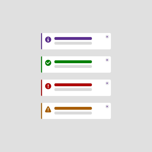
Message box
Message box communicate information and provide immediate feedback to the user.
-
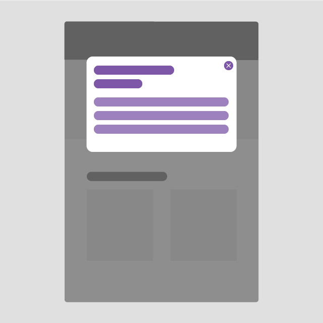
Overlayer
Overlayer inform users about a task and can contain information, require decisions, or involve multiple tasks.
-
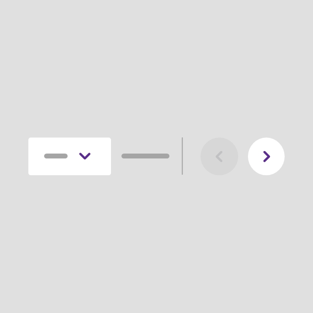
Pagination
Pagination is used to split up content or data into several pages, with a control for navigating to the next or previous page.
-

Panel
Panel is a highly flexible component that allows to display a wide variety of content.
-

Patches
Patches provide a way to highlight two kind of content: informational and promotional messages.
-
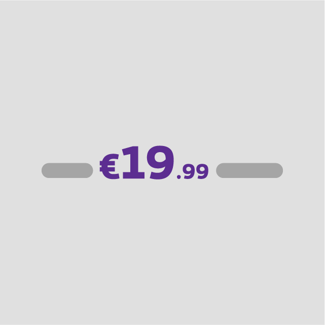
Prices
The price tag is used to emphasize the pricing of a special offer or a product. It's constructed in a way that it's highlighted from the rest of the content.
-
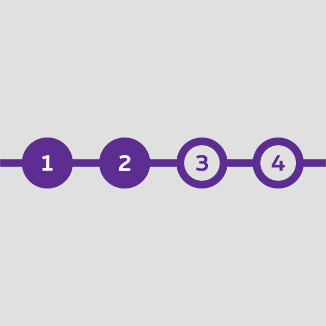
Progress indicator
Process indicator offers a clear way to inform user about the completion of a specified process.
-

Rating
Representation of user satisfation or opinion, commonly used to gather quick feedback across various contexts such as product reviews, surveys and user experience assessments.
-

Read more
Read more allows to shorten the page and to display the rest of the content only if the user decides to.
-
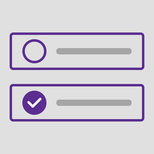
Selectable boxes
Selectable boxes allow the user to select options.
-
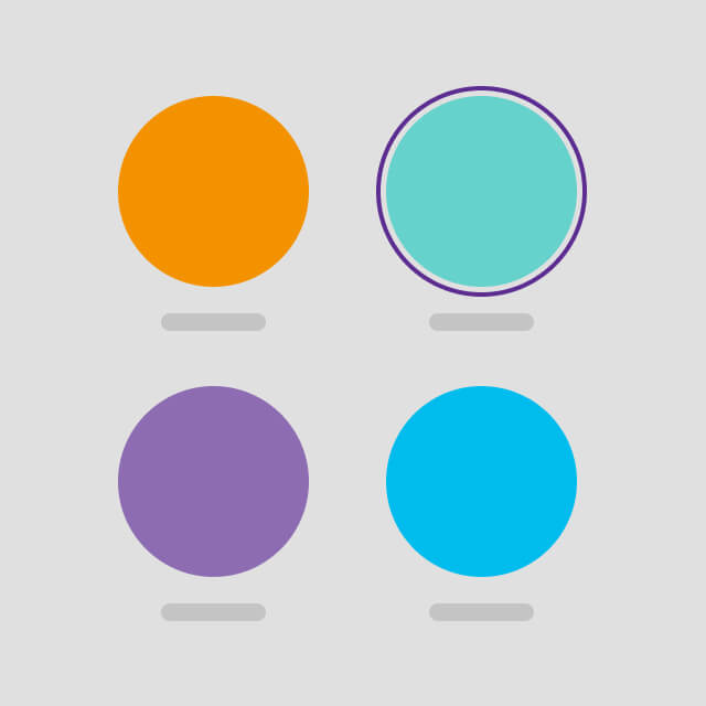
Selectable chips
This component is a selection tool, similar to selectable boxes, which allows the user to select unique or multiple options.
-

Spinner
Spinner inform users about the status of ongoing processes.
-
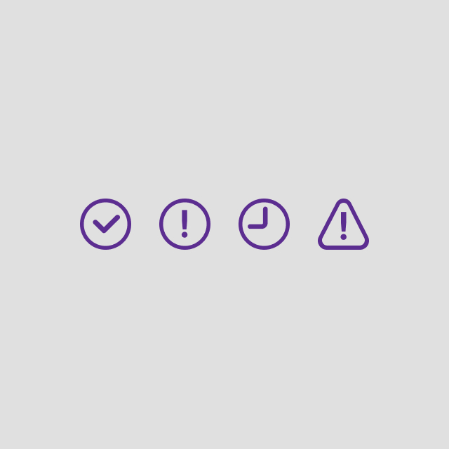
Status
Allowing the user to have an information concerning a status.
-
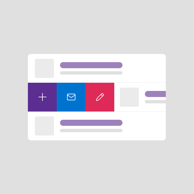
Swipe actions
A list of swipeable items - either left or right - that reveal possible actions to perform on the item
-

Switch
Switch is used to quickly select between two possible settings. They are commonly used for "on/off" setting.
-
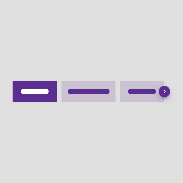
Sysnav
Sysnav offer a handy way to navigate with anchors within a page.
-
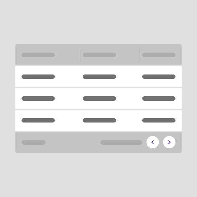
Tables
Tables are used to display a certain amount of data in a clear and efficient way. Depending on the type and amount of data, there are several types of tables available.
-
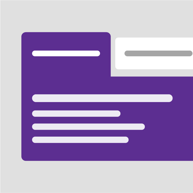
Tabs
Tabs organize and allow navigation between groups of content that are related and at the same level of hierarchy.
-
Tags
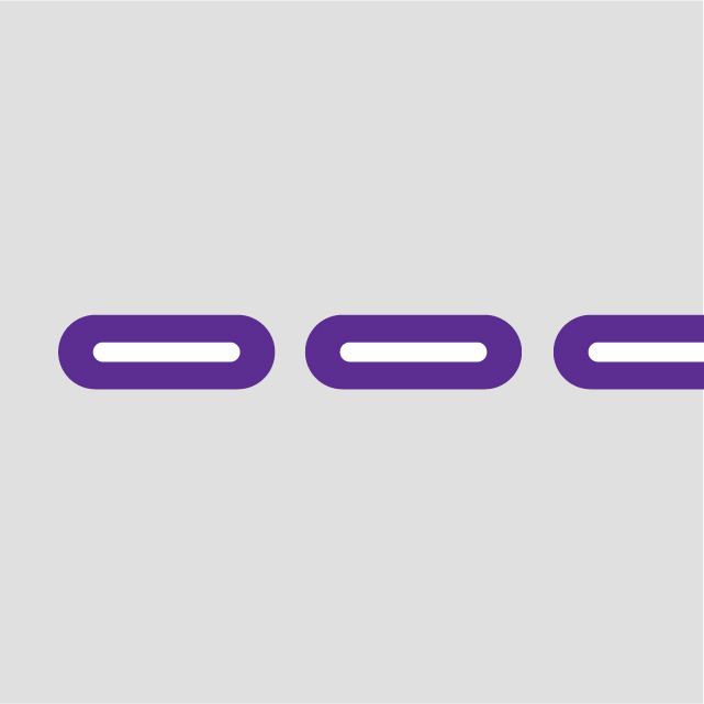
Tags allow users to make selections, filter content, or understand the categorisation of the content.
-
Timeline
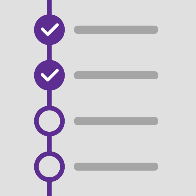
The timeline displays upcoming, current, and past activities.
-
Toaster
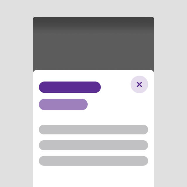
Toaster is a kind of overlayer coming from the left edge of the screen on desktop and from the bottom edge on mobile.
-
Toaster message
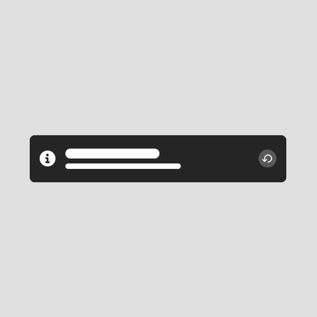
Toaster messages are intended to notify or inform the user of an action they took on a page.
-

Tooltips
Tooltips display additional information upon click, hover, or focus.