Please don't forget to read Usage part of each element.
Message box
expiry date: 30/04/2024
A message box is a graphical user interface element used to display information, alerts, or prompts to users within interfaces.
Types
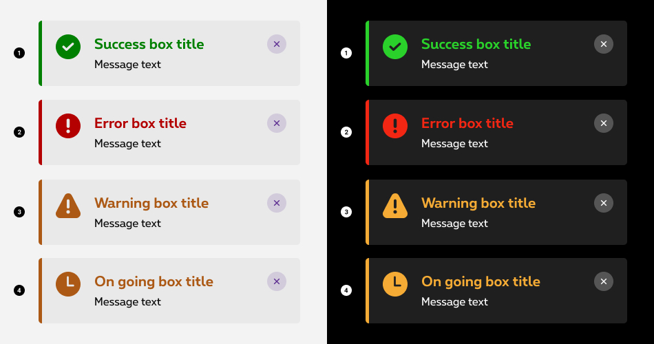
Message boxes are intended to inform users about events in the pages. Depending on the type of message, there are 2 categories of messages:
Status messages

- Success message
Displayed to give a direct feedback to the user when ordering or activating something. This type of message is also used for a congratulations message, when the user's action triggers something positive or additional than the initial request. Congratulation message offers a neat solution to trigger some surprise and delight. - Error message
Prompted when user input is incorrect, forbidden, or the system fails to operate a task. The error message helps the user by giving him the feedback about what error he encountered. - Warning message
Triggered when user is about to do a destructive action such as: deletion, non-reversible modification, etc. - On going message
Displayed to give a feedback to the user when a process has started but has not finished running.
Informative messages

- Default message
Gives short additional informations about a topic within the page. - Specific icon message
Gives short additional informations about a specific topic as a sustainability information in this case.
Behaviours
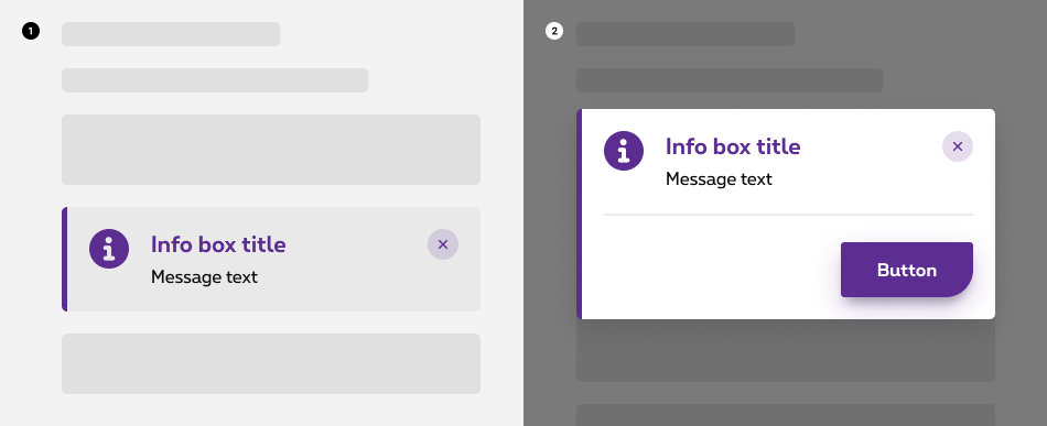
Two behaviors are possible when displaying a message box:

- Inline
Inline message boxes show up in task flows, to notify users of the status of an action. They usually appear at the top of the concerned content. - Overlayer
An overlayer message box appears in front of web page content to provide information or ask for a decision. Overlayers disable all page functionality when they appear, and remain on screen until confirmed, dismissed, or a required action has been taken. Dialogs are purposefully interruptive, so they should be used sparingly.
For more info about the overlayer behaviour, check out the overlayer article.
Anatomy

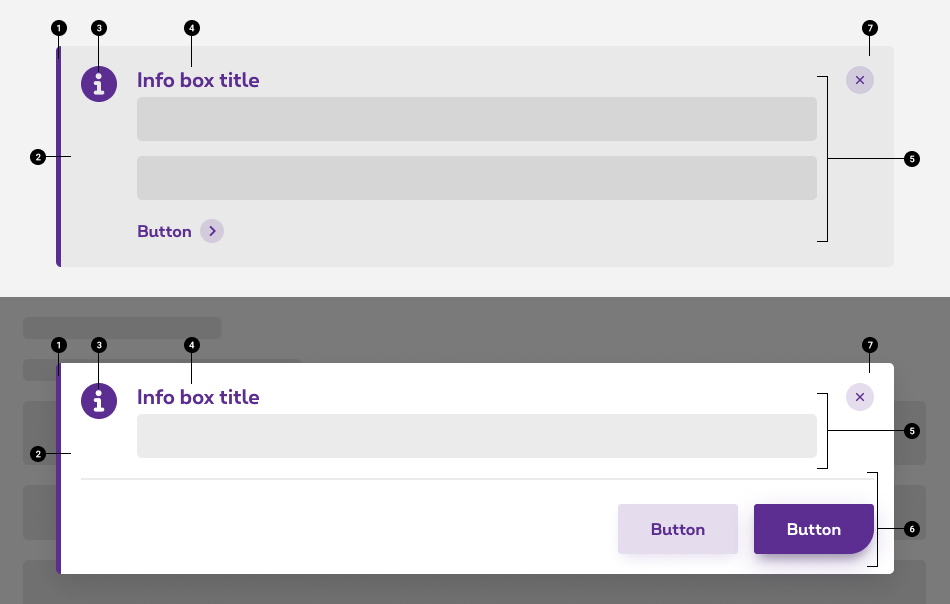
- Indicator type color
Depending on the type of message, the color changes to clearly show which kind of message it is. - Container
Container is displayed around the icon indicator and content with a solid color. - Icon indicator
The icon shows clearly which kind of message is it. The icon indicator is displayed in the indicator type color. For status messages, please adhere to the status color guidelines. In the case of informative messages, the default color should remain the primary color, unless the message necessitates a specific color, such as green to convey a sense of sustainability. - Title
Title give the user the context about the message box, it should be short and descriptive, explaining the most important piece of information. - Content (optional)
Desciption provide a more in-depth explanation over the message, it contains all the informations the users need to have in order to take the proper decisions. Explain how to resolve the issue by including any troubleshooting actions or next steps. Be concise and avoid repeating or paraphrasing the title.
In the inline behavior, you can include a link or a button within the content that redirect the user to next steps. Limit action labels to one or two words. - Action(s) zone (overlayer behaviour)
In the overlayer behavior, you can include a button within the action zone that redirect the user to next steps. - Close action link (optional)
The close action link gives the possibility to the user to close the message. For more info about the close action link, check out the actions article.
Dismissible or persistent
Message boxes do not dismiss automatically. They persist on the page until the user dismisses them or takes action that resolves the notification.
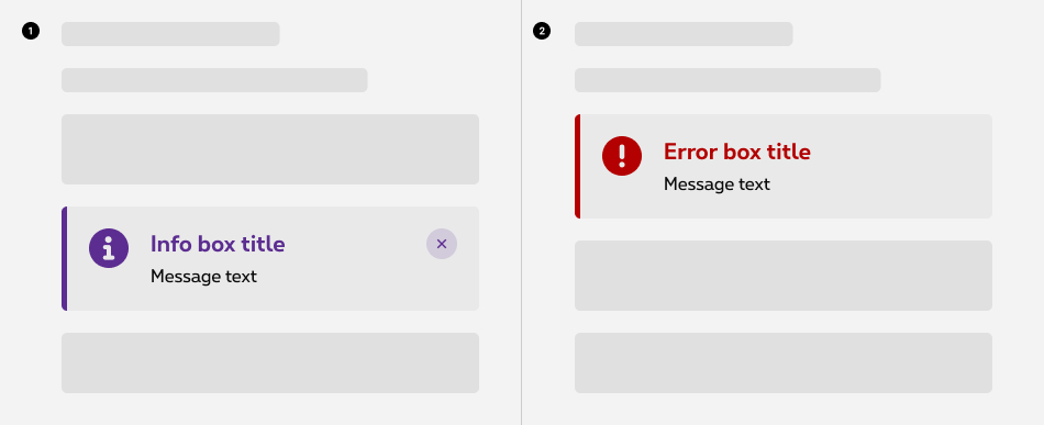
The close action button in the top right corner is used to dismiss message boxes. Including the close button is optional and should not be included if it is critical for a user to read or interact with the notification.

- Use dismissible message boxes when the information has been acknowledged and the message is no longer relevant.
- Use persistent message boxes when the information continues to be relevant after the message is shown.
Best practices
Sizing
The width of message boxes varies based on content and layout. They can expand to the fill the container or content area they relate to. Their height is based on the content length, which should not exceed two lines of text.
Placement
Message boxes appear near their related items.
Related elements
Error message box vs empty state
Use error message box when :
- There is no interaction between your interface and the user, and you need to display an error.
- There is an interaction between your interface and the user, and you need to display an error regarding something else than an no result situation like the user has type a wrong text or has not complete everything.
Use empty state when :
- There is an interaction between your interface and the user, and the users provide an input that return no results. The most common case is during searching and filtering results. If the query doesn't match with any result, the system will return an empty state.
More info about the empty state
Sizes and colors
To create a message box, use the following
All
| Name | Type | Description | Default value |
|---|---|---|---|
| sTitle | string | Title | "This is the title" |
| sMessage | string | Content | "<p>This is the message</p>" |
| bCloseBtn | boolean | Show close button | true |
| bTitle | boolean | Show title | true |
| bMessage | boolean | Show content | true |
| sCloseLabel | string | Close label | "Close the message box" |
| bModal | boolean | Display as overlayer | false |
| sModalId | string | Overlayer ID | "msg-overlayer" |
| bModalSmall | boolean | Display as small overlayer | false |
| bModalFooter | boolean | Show footer | false |
| sModalFooterContent | string | Footer content | "<p>This is the footer</p>" |
| bModalUnclosable | boolean | Overlayer unclosable | false |
| sXtraClass | string | Extra class to rs-msgbox
container |
"" |
Inline status
role="alert"
attribute must be present in the message box container. The alert role is for important, and usually time-sensitive, information.
As they don't receive focus, focus does not need to be managed and no user interaction should be required. If the user is expected to close the alert, then use overlayer version.
Repurposed a (no href):
If you must use an a
tag to trigger an action without navigation like here for Close button, add role="button"
and tabindex="0"
.
If you use role="button"
on an a
tag that still has an href
, you create a semantic conflict where the element is announced as both a link and a button, which can confuse screen reader users.
Success / Confirmation
Add rs-success
class to the element containing rs-msgbox
class.
This is the message
For negative render, add rs-neg
class to the element containing rs-msgbox
class.
Error
Add rs-error
class to the element containing rs-msgbox
class.
For negative render, add rs-neg
class to the element containing rs-msgbox
class.
Warning
Add rs-warning
class to the element containing rs-msgbox
class.
For negative render, add rs-neg
class to the element containing rs-msgbox
class.
On going
Add rs-ongoing
class to the element containing rs-msgbox
class.
For negative render, add rs-neg
class to the element containing rs-msgbox
class.
Inline informative
role="alert"
attribute must be present in the message box container. The alert role is for important, and usually time-sensitive, information.
As they don't receive focus, focus does not need to be managed and no user interaction should be required. If the user is expected to close the alert, then use overlayer version.
Repurposed a (no href):
If you must use an a
tag to trigger an action without navigation like here for Close button, add role="button"
and tabindex="0"
.
If you use role="button"
on an a
tag that still has an href
, you create a semantic conflict where the element is announced as both a link and a button, which can confuse screen reader users.
Default
For negative render, add rs-neg
class to the element containing rs-msgbox
class.
Specific icon
Sustainability
For negative render, add rs-neg
class to the element containing rs-msgbox
class.
Overlayer status
Alert dialogs are used to convey messages to alert the user.
-
role="alertdialog"attribute must be present in the overlayer container -
associate overlayer and title:
- you must provide an accessible name for a dialog, which can be done with the
aria-labelledby="ac-MsgOverlayerID-label"attribute in the overlayer container - add the same id
in
rs-msgbox-titleelement
- you must provide an accessible name for a dialog, which can be done with the
-
associate overlayer and content (not mandatory, but highly recommended):
- you should use
aria-describedby="ac-MsgOverlayerID-content"in the overlayer container to reference the alert message element in the dialog - add the same id
in
rs-msgbox-contentelement
- you should use
- for the focus trap, you need at least one clickable element ( <button> or <href> ), including the close button!
Closing the overlayer:
-
title="Close the overlayer"attribute is added to a <span> to display a tooltip explaining the purpose of the close button. - within this <span> , an extra <span class="show-for-sr">Close the overlayer</span> is added so that screen readers can detect it
-
The copy has to be translated in the following languages:
- EN: "Close the overlayer"
- FR: "Fermer fenêtre"
- NL: "Sluit venster"
aria-labelledby
and aria-describedby
are automatically generated by the
To make the overlayer small, add class rs-reveal-modal-small
to the <div>
containing rs-reveal-modal
.
Success / Confirmation
Add rs-reveal-msgbox-success
class to the element containing rs-reveal-msgbox
class.
Add rs-success
class to the element containing rs-msgbox
class.
This is the message
For negative render:
- add
rs-reveal-msgbox-negclass to the element containingrs-reveal-msgboxclass - add
rs-negclass to the element containingrs-msgboxclass
This is the message
Error
Add rs-reveal-msgbox-error
class to the element containing rs-reveal-msgbox
class.
Add rs-error
class to the element containing rs-msgbox
class.
This is the message
For negative render:
- add
rs-reveal-msgbox-negclass to the element containingrs-reveal-msgboxclass - add
rs-negclass to the element containingrs-msgboxclass
This is the message
Warning
Add rs-reveal-msgbox-warning
class to the element containing rs-reveal-msgbox
class.
Add rs-warning
class to the element containing rs-msgbox
class.
This is the message
For negative render:
- add
rs-reveal-msgbox-negclass to the element containingrs-reveal-msgboxclass - add
rs-negclass to the element containingrs-msgboxclass
This is the message
On going
Add rs-reveal-msgbox-ongoing
class to the element containing rs-reveal-msgbox
class.
Add rs-ongoing
class to the element containing rs-msgbox
class.
This is the message
For negative render:
- add
rs-reveal-msgbox-negclass to the element containingrs-reveal-msgboxclass - add
rs-negclass to the element containingrs-msgboxclass
This is the message
Overlayer informative
Alert dialogs are used to convey messages to alert the user.
-
role="alertdialog"attribute must be present in the overlayer container -
associate overlayer and title:
- you must provide an accessible name for a dialog, which can be done with the
aria-labelledby="ac-MsgOverlayerID-label"attribute in the overlayer container - add the same id
in
rs-msgbox-titleelement
- you must provide an accessible name for a dialog, which can be done with the
-
associate overlayer and content (not mandatory, but highly recommended):
- you should use
aria-describedby="ac-MsgOverlayerID-content"in the overlayer container to reference the alert message element in the dialog - add the same id
in
rs-msgbox-contentelement
- you should use
- for the focus trap, you need at least one clickable element ( <button> or <href> ), including the close button!
Closing the overlayer:
-
title="Close the overlayer"attribute is added to a <span> to display a tooltip explaining the purpose of the close button. - within this <span> , an extra <span class="show-for-sr">Close the overlayer</span> is added so that screen readers can detect it
-
The copy has to be translated in the following languages:
- EN: "Close the overlayer"
- FR: "Fermer fenêtre"
- NL: "Sluit venster"
aria-labelledby
and aria-describedby
are automatically generated by the
To make the overlayer small, add class rs-reveal-modal-small
to the <div>
containing rs-reveal-modal
.
Default
This is the message
For negative render:
- add
rs-reveal-msgbox-negclass to the element containingrs-reveal-msgboxclass - add
rs-negclass to the element containingrs-msgboxclass
This is the message
Specific icon
Sustainability
This is the message
For negative render:
- add
rs-reveal-msgbox-negclass to the element containingrs-reveal-msgboxclass - add
rs-negclass to the element containingrs-msgboxclass
This is the message
Overlayer with complex footer
This is the message
Angular
Building your pages with Angular? Add the following attribute to the element containing class rs-msgbox
:
-
data-ng-non-bindable
This will prevent the data-alert
attribute from being misread as an Angular directive (due to mm-foundation), which would cause the DOM to be altered and, as a consequence, the layout would break.
JavaScript
Follow Overlayer JS rule for Message overlayer.
Deprecated
The following classes have been simplified and replaced.
-
rs-msgbox-negis deprecated and simplified tors-neg -
rs-msgbox-successis deprecated and simplified tors-success -
rs-msgbox-erroris deprecated and simplified tors-error -
rs-msgbox-warningis deprecated and simplified tors-warning -
rs-msgbox-ongoingis deprecated and simplified tors-ongoing
The message boxes below are not accessible and should no longer be used.
This element will no longer be available from the expiry date meaning the related css will be removed and the element design will be broken if it's not adapted to the new html.
Class:
-
alert-box -
rs-alert -
rs-alert-login -
rs-alert-confirm -
rs-alert-error -
rs-alert-info -
rs-alert-cookie
The message boxe below is not accessible and should no longer be used.
This element will no longer be available from the expiry date meaning the related css will be removed and the element design will be broken if it's not adapted to the new html.
Attribute: role="alertdialog" aria-live="assertive"
Configuration metadata (DSMessageBoxComponent)
Selector: ds-message-box
Class: DSMessageBoxComponent
Use case example
NOT AVAILABLE LIVE PREVIEW
Inputs
| Name | Type | Default | Required | Description |
|---|---|---|---|---|
| forwardText | string | null | No | The button label to the right(forward) place of the message box |
| backwardText | string | null | No | The button label to the left(backwards) place of the message box |
| showCross | boolean | undefined | No | Shows/Hides the cross(close button) for the top right of the message window |
| closeMessageBoxTranslation | string | Close the message box | No | The on:Hover cross label |
| isNegative | boolean | false | No | Defines light/dark style of the component |
| cypressTag | string | undefined | No | Automation test tag |
| messageType | MessageBoxTypesEnum | undefined | Yes | Defines the message box type |
| specificIcon | IconEnum | null | No | Defines a specific icon, like Sustainability |
Outputs
| Name | Type | Description |
|---|---|---|
| forwardEmitter | EventEmitter | Emits when forward button is clicked |
| backwardEmitter | EventEmitter | Emits when backward button is clicked |
| crossEmitter | EventEmitter | Emits when cross(close button) is clicked |
Models
        export enum MessageBoxTypesEnum {
            Success,
            Error,
            Warning,
            Congratulation,
            Information,
						OnGoing
        }
Configuration metadata (DSOverlayerMessageComponent)
Selector: ds-overlayer-message
Class: DSOverlayerMessageComponent
Use case example
NOT AVAILABLE LIVE PREVIEW
Inputs
| Name | Type | Default | Required | Description |
|---|---|---|---|---|
| id | string | undefined | Yes | Component unique id |
| showModal | boolean | undefined | Yes | Component unique id |
| footerMainButtonLabel | string | false | No | Show/Hide the overlayer message box |
| footerMainButtonDisabled | boolean | false | No | Show/Hide the main(right) button from the footer |
| footerMainButtonCypresTag | string | null | No | Automation test tag for the main(right) button |
| footerSecondaryButtonLabel | string | null | No | The button label to the secondary(left) button of the message box |
| footerSecondaryButtonDisabled | boolean | false | No | Show/Hide the secondary(left) button from the footer |
| footerSecondaryButtonCypresTag | string | null | No | Automation test tag for the secondary(left) button |
| footerLinkButtonLabel | string | null | No | Automation test tag for the secondary(left) link button. No button rendering just a link. |
| footerLinkButtonCypresTag | string | null | No | Automation test tag for the secondary(left) link button |
| showCross | boolean | false | No | Shows/Hides the cross(close button) for the top right of the message window |
| closeMessageBoxTranslation | string | Close the overlayer | No | The on:Hover cross label |
| isNegative | boolean | false | No | Defines light/dark style of the component |
| small | boolean | false | No | Defines if the overlayes message box is small or normal size |
| cypressTag | string | undefined | No | Automation test tag for the whole component |
| messageType | MessageBoxTypesEnum | undefined | Yes | Defines the message box type |
| specificIcon | IconEnum | null | No | Defines a specific icon, like Sustainability |
Outputs
| Name | Type | Description |
|---|---|---|
| footerMainButtonClick | EventEmitter | Emits when footer main button is clicked |
| footerSecondaryButtonClick | EventEmitter | Emits when footer secondary button is clicked |
| footerLinkButtonClick | EventEmitter | Emits when footer secondary link button is clicked |
| onClose | EventEmitter<OverlayerMessageCloseTypeEnum> | Emits when the overlayer is closed. Also emits the way it was closed by cross, by ESC key or by clicking the backdrop. |
Models
        export enum OverlayerMessageCloseTypeEnum {
            CROSS = 'CROSS',
            BACKGROUND = 'BACKGROUND',
            ESC = 'ESC',
        }
Configuration metadata (DSLoadingMsgComponent)
Selector: ds-loading-msg
Class: DSLoadingMsgComponent
Use case example
Inputs
None
Outputs
None
Models
None